Refreshed website experience to rev up motorcycle safety education
An end-to-end process of the website refresh for RideForever a nation-wide motorcycle safety initiative.
08 Jun, 2022
Project context
Ride Forever was born with a mandate to start a conversation with riders, supply valuable information and encourage them to make better choices.
There was realisation that conventional safety messaging and programs wouldn’t resonate with the majority of riders. Motorcyclists knew their passion involved risk and accepted it.
What was needed was a way to engage with riders and find solutions they would take up and endorse. Which meant RideForever needed to stay motorcycle friendly and really resonate with motorcyclists as a place they wanted to come get information from.
Project objective
To deliver a refreshed RideForever website that optimised user flows and information to increase sign-ups and attendance of motorcycle safety classes.

Approach & deliverables
As we were standing up a refreshed website, rather than a complete overhaul, it was vital for us to keep the existing website as a comparison for customers.
This led us to working on a beta website alongside the existing website so we could measure whether we were hitting the mark or not.
Throughout the project we delivered:
Beta website (to eventually swap out as the official site)
Supporting UX performance reports to track how features were received
Review of information architecture along with revised structure
A continuous discovery mechanism
Collaboration
This project was a collaboration between:
Product design
Product team
Business stakeholder group
Output
The final website can be found here: www.rideforever.co.nz
Understanding a new customer segment to solve customer problems & meet business objectives
As the team were initially brought on to the project to refresh the website, with the aim of increasing in-person class sign ups, our core project goals were tied to certain KPIs. However outside of this goal I was free to guide the RideForever team with more user focused goals.
An increase in customer sign ups to the on-road coaching classes
The main goal of the RideForever program itself is to increase motorcycle safety on the roads of Aotearoa. To do so they provide motorcyclists with a range of classes that help teach people safe riding techniques, along with qualifications. The purpose of this refresh was to renew interest in the classes and increase attendance nationwide.
An increase in customers awareness and understanding of the RideForever program
An insight I identified right at the beginning was that people didn’t really understand what RideForever was, why it existed and what the purpose of it was. Part of this work was to help the program better explain it’s goals and purpose to New Zealand citizens.
A reduction in calls/demand to the supporting team regarding their services
The team who manages the content and national program run lean. Meaning the less time they had to dedicate to manual tasks the more they could allocate to work that focuses on the betterment of the program.
Ongoing engagement with customers: Learning continuous exploration through a beta website
Creation of a continuous discovery mechanism
Feature ideation
Quick fire evaluative testing with customers
Design iterations
Feature release to beta
Quantitative feedback (customer’s opt-in)
Repeat
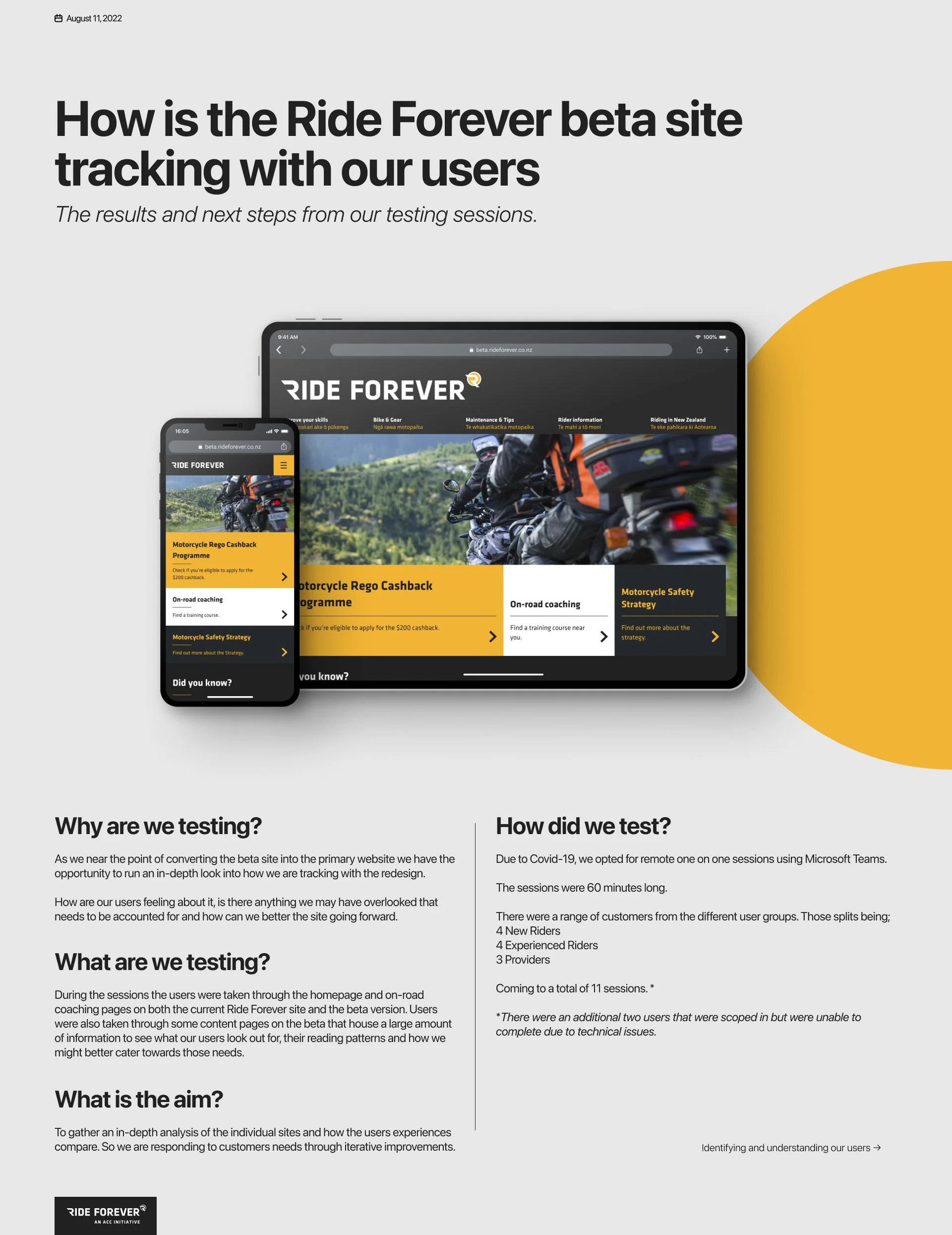
It was important to gather feedback from the community as the team built new features. At the end of the day the website needed to be a place the community wanted to come to get their safety information.
I engaged with the community through various rounds of remote user testing using Figma prototypes. Once myself and the team were comfortable about our approach we would release the feature to the beta website which housed our feedback mechanisms. This acted as a great way to receive quantitative feedback from a wider audience, there were also opportunities for customers to sign up to our closed user testing.
After each feature release I kept an eye on our feedback mechanisms to see how each feature was landing and whether it needed further revisions. These findings were delivered to the team and key stakeholders through presentations.
While working on a dynamic website like a beta, having a strong user feedback system is crucial. When dealing with an expressive community keen on sharing feedback, allowing them to give input and witnessing changes based on their feedback makes them feel important and involved in the new website. This approach was key in aligning with the essence of the RideForever program.
Self-serving education to increase engagement for on-road classes
The RideForever program also offered an online coaching system to complement the on-road coaching classes by acting as a precursor to drum up engagement and sign ups.
The online coaching feature was split into bike types to provide different modules for each specific rider level. The modules included a basis of safety rules and tips presented through videos and imagery.
It was crucial to continue this in the beta by making the modules more engaging and valuable for customers. The team also saw a chance to attract users who might be hesitant to join a class with motorcyclists, like scooter riders.
For this feature, the team used Google Analytics to track module and video content completion rates, helping the small content team focus their efforts effectively.

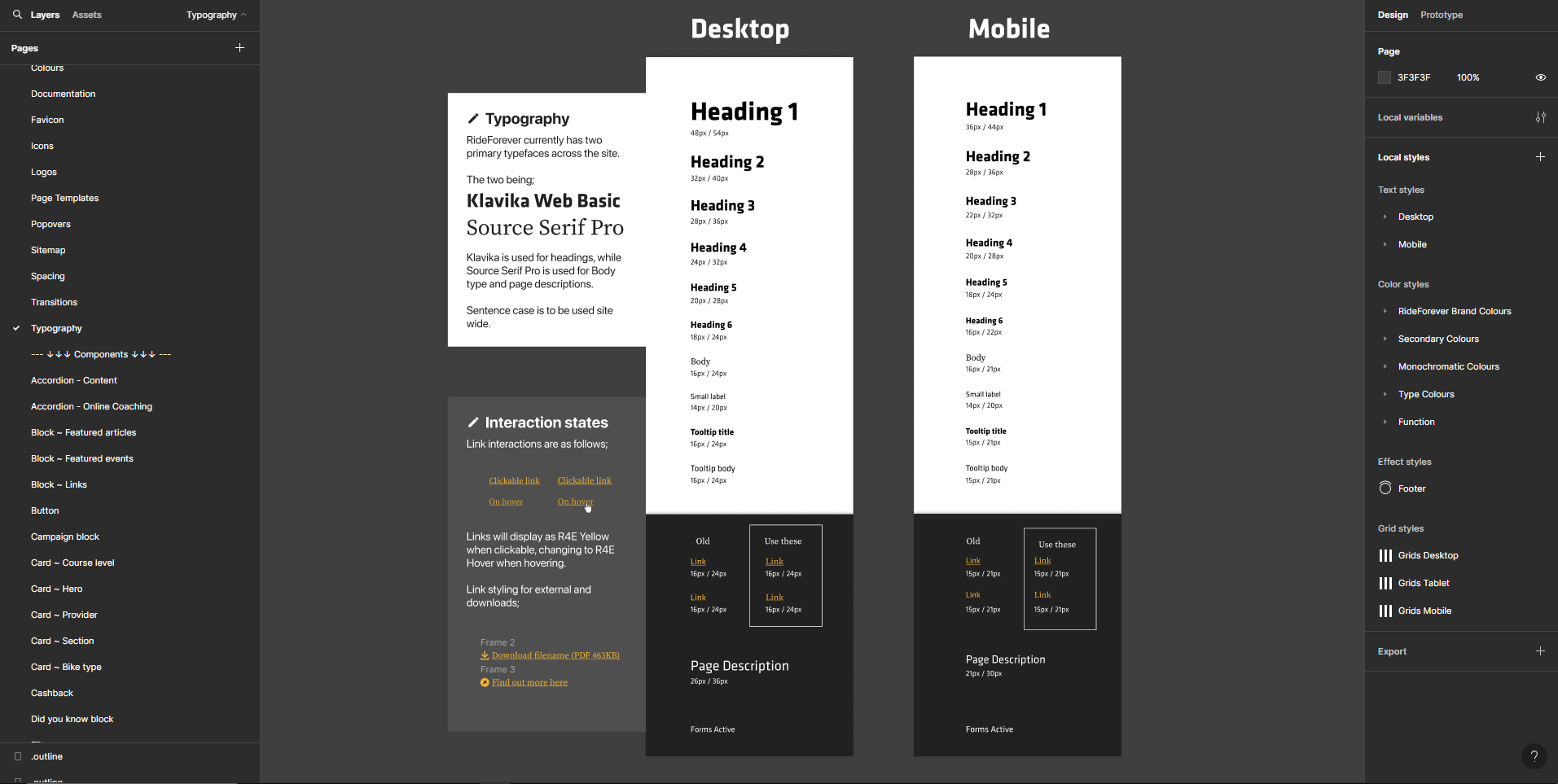
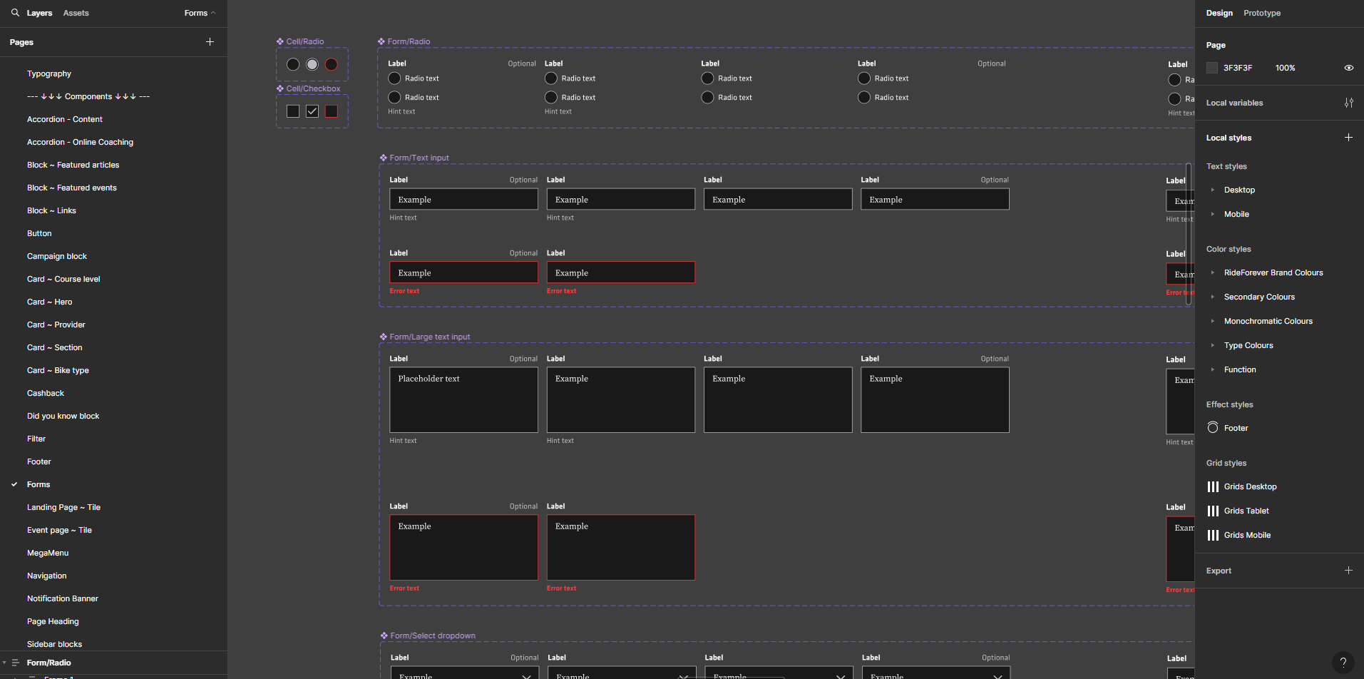
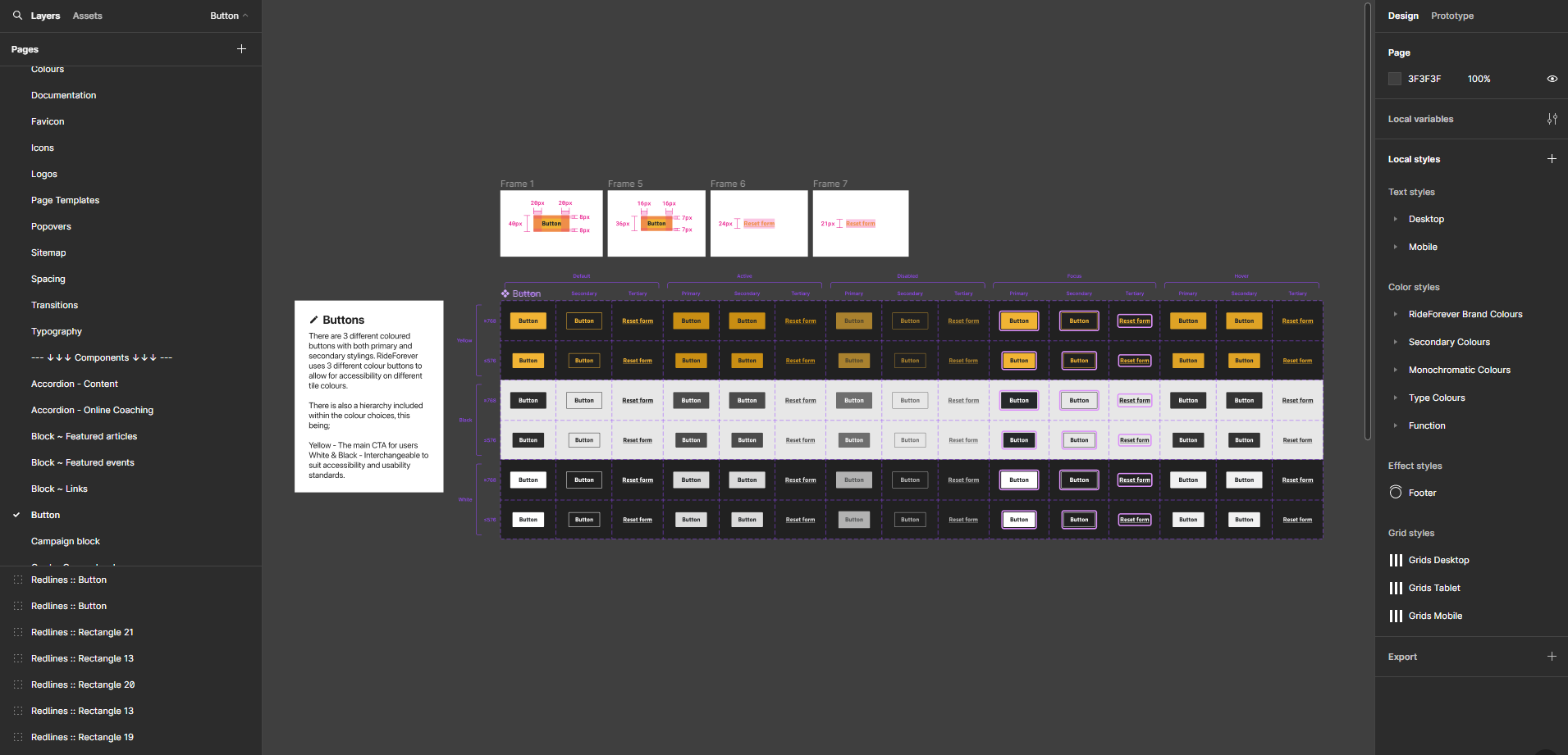
Building a design system to ensure consistency with future enhancements
The website was created by an external agency, so we didn't have any design guidelines or system. Without an in-house design system team, I had to create and document a design system as I went.
I received the branding file from the brand team and used it to create basic design elements. Such as design system foundations, typography, colour ramps and accents.
Establishing a strong foundation enabled me to document design choices effectively, maintain consistency in future features, and align with the development team. It also provided a platform for discussing technical details with developers before implementation.
As I migrated off product, I passed the design system to other designers. This has saved time and maintained design consistency across new features.
Closing thoughts
Overall, this project was positive, being involved in a skilled team on an engaging and innovative product. Throughout the project I gained valuable insights into remote user testing a skill that holds significant relevance in today’s digital landscape. Managing the project presented challenges, particularly in finding the delicate equilibrium between advancing business objectives and incorporating user input to enhance the product offering.